If you’ve been reading my Zebra Report for any length of time you’ll know that I’m absolutely, positively passionate about the power of branding.
Not only has my company been creating powerful brands for years, I’ve even written an industry white paper to help business owners understand why they need to create a strong brand if they want a sustainable business.
Today I want to talk about one aspect of branding — typography! I recently read a Mashable article that reminded me about the importance of typography.
And before I forget … a little later I’m going to ask some questions of a special guest!
Definition – typography: the general character or appearance of printed matter.
Specifically, I want to chat today about what the font you select says about you, and how it helps position your brand. I’m always surprised when we start working with clients on branding projects to hear that they may have thought extensively about colors they want to use – or other visual imagery – but they’ve given virtually no thought to fonts or typography!
Years ago, our handwriting and our signature said a great deal about us. With the evolution of type and printed materials – combined with the rise of the internet – today our font selection does the same.
The font you select when communicating your company’s message to the world says a great deal. Select the wrong font and you could be facing challenges with legibility. Beyond this obvious issue, the message of your company must match the message of your font.
Let’s take a look at a couple of examples.
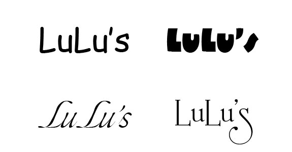
If you own a high-end bridal shop – let’s call it LuLu’s – you are probably not going to use a chunky, cartoonish font. Most luxury bridal boutiques feature fonts in an elegant script, supported by visuals that convey a feeling of elegance.

Owners of home improvement stores, on the other hand, are unlikely to use detailed and lyrical fonts. Their target market will respond more favorably to strong, bold typography, with a very traditional color palette.

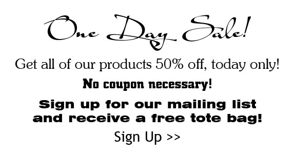
That brings me to one of my pet peeves! Have you ever seen marketing materials developed by someone where they’ve used (or over-used) fonts for emphasis? It seems like every other line is a different font.

In a case like this, the company’s message is completely lost in the cacophony of the visual look of the piece. There’s no time to discern the message when you’re eye is darting from line to line, trying to make sense of it all!
I actually believe that introducing a second complimentary font into your marketing can be very beneficial. The second font can be from the same font “family”, or it can be from an unrelated family to provide additional contrast. When you employ a secondary font, think carefully about when, where, and how to use it. A natural choice is for headings – and subheadings – allowing you to draw attention to sections as needed.
Remember that special guest I mentioned earlier? It’s time to introduce my CEO, Shauna Naf! Not only is Shauna an amazingly competent CEO, her background is in graphic design. That means she has lots of great ideas when it comes to fonts and typography. I’ve asked Shauna to chat with us on this topic, since it’s one of her areas of expertise.
Q: Shauna, what is the most common mistake you see business owners make when it comes to fonts?
A: It’s easily too much experimentation, and too little consistency. I see high-end businesses trying a cutesy fonts like ![]() or
or ![]() because the creative team was in the mood that day to try something different “just because”.
because the creative team was in the mood that day to try something different “just because”.
Q: It seems like there are fonts that become popular … one day they’re new on the market, and the next day you see them everywhere. Why does this happen?
A: You’re right Denise – that happens a lot! Sometimes it is because a new version of a popular software program came out, and the font was included as a free option. So when a new font comes out and is readily available at the click of a mouse, people naturally want to try it out. Then it is everywhere!
Q: What are a few examples of this?
A: Think about a font called ![]() . It was something different than what people were used to seeing (think of common fonts such as
. It was something different than what people were used to seeing (think of common fonts such as ![]() , or
, or ![]() ) … and anyone who wanted a unique font glommed onto it.
) … and anyone who wanted a unique font glommed onto it.
Q: How can business owners avoid selecting a font that is just like everyone else’s font?
A: We recommend thinking about the elements of your brand – what your company represents, what the client experiences, and what the product represents. With that in mind, go search for the right font. You may need to “try on” several fonts before finding the right fit.
For example, think about fonts used in logos. You wouldn’t expect companies such as Kmart and Sears to have the same feel as Macy’s or Nordstrom. The fonts used by each of those companies definitely convey different feelings, and different client experiences.
Q: Where can people find examples of fonts?
A: Everywhere! If you are considering choosing a font, I urge you to grab a magazine. Look not only at ads, but also at editorial stories. Find examples of what you like. Then find someone like me who is obsessed with typography, and can sometimes identify fonts on sight! If you don’t have someone like that in your life, myfonts.com has a great feature that allows you to upload a scanned image of a font … which the program then identifies for you.
Myfonts.com also has a very helpful feature that allows you to type in your sample text so you can see how the font will look when applied. Sometime you find a font you love … but you discover certain letters just don’t work as you might expect. Say your company name is Jane Larson Interiors, but the J of the font you have selected isn’t legible. That can be a problem!

Q: Is there a “wrong” font to use?
A: Yes – the font that does not match your company brand or message.
Q: How many fonts are there to pick from?
A: Thousands and thousands. Font artists (also known as typographers) are creating new fonts all the time. In fact, when you work with type as much as we do, you may find that you are drawn to certain typographers and look for their new work as it is released. For example, I am drawn to the artistry of Rob Leuschke. We have purchased licenses for many of his fonts on behalf of our clients and he once emailed me personally to thank us for making his fonts so popular. I thought I might swoon!
Q: How much do fonts cost?
A: Great question! Many fonts are free … and some are several hundred dollars. You can find many, many fonts in the $25-$50 range. Sites such as myfonts.com or veer.com are good places to start.
Q: What about custom created font alphabets? Are these a viable solution for businesses?
A: They certainly can be if the font matches the business model. For example, several of our real estate agent clients have created their own font based on their handwriting, which allows them to easily insert a note into a bulk printed piece. It looks like they have included a custom note on each piece!
Q: And finally… your personal font favorites? Share the three fonts you’re currently crazy about with our readers.
A: I really love ![]() (Carpenter). Although it is not the most legible font out there, used sparingly it can be quite effective.
(Carpenter). Although it is not the most legible font out there, used sparingly it can be quite effective.
I have also been a big fan of ![]() by AM Cassandre, a 1930s-era typographer who created well-known French travel posters in an Art Deco style.
by AM Cassandre, a 1930s-era typographer who created well-known French travel posters in an Art Deco style.
In terms of the classics, I find ![]() to be a very versatile font which I use it quite often.
to be a very versatile font which I use it quite often.
There you have it! Some ideas about typography, and fonts, as it relates to your company’s brand. If you haven’t already done so, please feel free to download my free white paper on branding.
Of course, I would love to hear your thoughts on fonts and typography! If you are creating marketing materials, or a brand, how much energy are you putting into this key element?


 Posted in
  Tags:
Tags: 

Love this! I am a big fan of fonts too and agree they are a big part of branding.
Thanks for the feedback Kate – glad you liked the article!
Excellent and too often overlooked topic. That’s for sharing, Denise.
You’re the best.
The Campbells of RE/MAX
Hi Robert! Thanks for the comment — I’m glad you enjoyed the article. Typography really is an overlooked topic, and I’m hoping the post will get more agents to think about this important element of their brand.
[…] Denise, I liked your article on typography. I chose a new font, but when I showed it to a colleague in the office they said it was “too […]