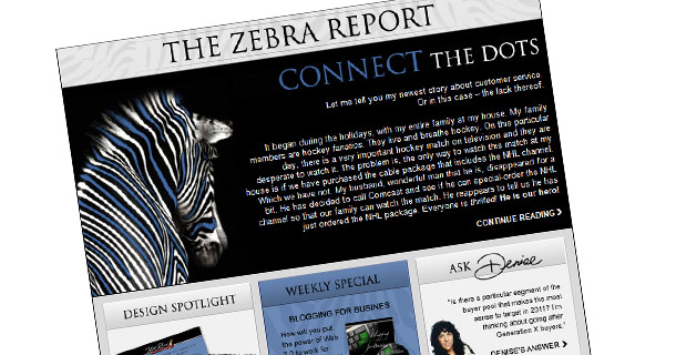
In case you haven’t noticed, the Zebra Report has been given a makeover. Even zebras need to be freshened up from time to time! Basically, this is called a branding update. It’s not changing the components, or the message, or the primary colors – it’s giving our brand a tune-up. A makeover. Our zebra has enjoyed a day at the spa.
Companies do this all the time. Two companies in particular – Coca Cola and Pepsi – have done great job of brand evolution over the past 50 years. Their marketing gurus know how to take a look at what’s happening in the market and what’s happening with the consumer, and then rework their brand to better suit the needs of their ‘now’ customers. It’s very interesting to look at the evolution of their brands over the years. The elements stay the same. There are just subtle changes. But they are important changes.
So why did we freshen up our Zebra Report? For many reasons.
A major concern of ours has been that our readers – you – are busy people. They have a short amount of time to read articles online. Because our Zebra Report is sent out each and every week, we didn’t want it to get lost in the weekly communication shuffle.
We also wanted you to have a new, fresh, and better experience when you open up the Zebra Report. We wanted to continue with a similar look & feel, but also develop an easy way for you to remember our articles. So now, each week, our zebra – and other elements of our Zebra Report – will have a distinct color, which is drawn from the Design Spotlight section of the report. This gives the Zebra Report a pulled-together, cohesive feel, and will help you when you’re trying to remember an article. You’ll be able to say to yourself, “Oh, I know. It was the blue zebra from two weeks ago.” We want you to have an easy memory marker.

Note that we didn’t divert from our main color scheme: black, white, and shades of gray. We simply added a flexible accent color to create a memory marker.
Lastly, we felt that it was time to bring in a more elegant element to our zebra and our brand. We all know that zebras are black/white and can look somewhat harsh. We wanted to better match our zebra to our product line. We are not a mass-marketing company; we offer customized high-end solutions and very effective custom training. We want our brand – and our Zebra Report – to truly reflect who we are and what we do.
How does all this apply to you?
As a real estate agent, your branding says a lot about how your services will benefit potential clients. Let’s say you have personalized branding and marketing tools which were created for you ten years ago. Your brand fits you, it reflects your personality and your business, and yes, it worked wonders when you first implemented it. But how does that brand speak to clients in 2011?
Buyers and sellers in 2011 are more media and tech-savvy than ever before. They’re looking for agents who not only know their market, but who are current with the tools and marketing platforms that the most successful agents – and companies – are utilizing. You may be at the top of your game when it comes to technology, but if your marketing materials look like they were crafted ten years ago, your potential clients may not be so sure. Before you’ve even had a chance to introduce yourself and explain your services, they may have already made an assumption about you that is quite inaccurate.
Ask yourself this – does your look, or your brand, need refreshing? Does it need a day at the spa? I want you to really think about it. I want you to think about how your sphere and clients have changed over the years, and make sure that your brand is still relevant to them.
Our Zebra Report needed an update – and we couldn’t be happier with the final results! We’ve had fantastic comments, and we’d love to have you let us know what you think. Does it give you a strong memory marker? Is our new format easier to navigate? You can offer your input by taking our short survey, below.
One last thought: this week’s Zebra Report topic is so near and dear to me, that I’d like to share a recording of a presentation that I gave about branding. If you’d like this free recording, click here to download.
[polldaddy poll=4532193]
Not subscribed to the Zebra Report?
Sign up today to receive our free weekly electronic newsletter that will keep you up-to-date on sales, provide essential marketing and business building tips and articles as well as technical, internet marketing information and advice. You’ll also receive special offers and discounts on featured products and services.


 Posted in
  Tags:
Tags: 

I especially like how you updated the animated Zebra at the top of the second page – that’s new, right? Seems lighter, more contemporary, good job.